For this blog post I decided to go with my best linear regression model of fit = lm (w$int_rate ~ w$annual_inc + w$total_pymnt).
For this post I will be testing all the assumptions from this module.
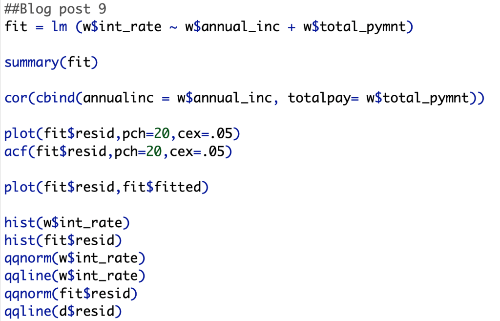
Assumption 2:
First, we will test for perfect multicollinearity. As we can see in the screenshot below, we can see that my model does have multicollinearity, but it is far from perfect. We can say this this assumption is true within my model.
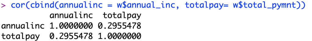
Assumption 3:
Second, we now plot the residual errors of my model. As we can see in the screen shot below, there is no underlying pattern within the plot, so we can say that there is independence within our data, meaning there is no pattern from one datapoint to the next.
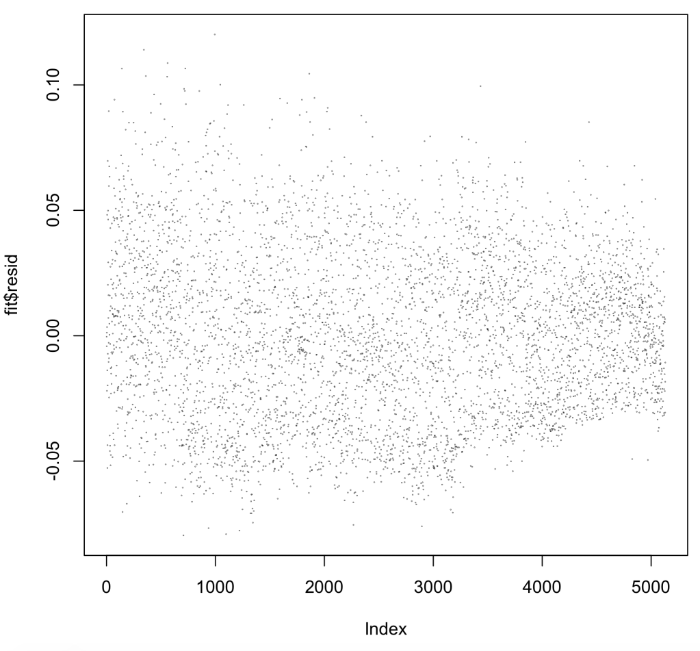
Next, we ran the code acf(fit$resid,pch=20,cex=.05) to see if there is correlation between the errors in my dataset. As we can see below, R says that there is correlation between each of the data points, but this could also be because of a factor like the dataset being sorted in a specific way. I believe this because all of the lags are significant in a positive direction which may likely mean the data is sorted and not random. Unfortunately because of this, my model does not pass this assumption. I will now look at the other assumptions to see if my model is flawed.
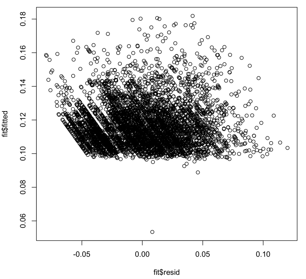
Assumption 4:
In assumption 4, we are looking to see if my dataset has heteroskedasicity, an unwanted variance in my models ability to predict interest rate within certain ranges. As we can see in the chart below, we pass this test, but we also want to note that most of the values on the chart lie above the Y value of .1. This most likely means that most of my interest rates are above a base rate. We pass this assumption
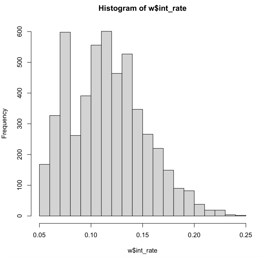
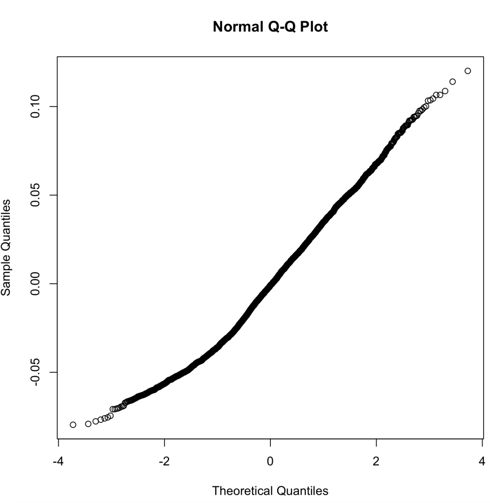
Assumption 5:
In this assumption we now are looking at normal distribution within our data, as well as our residual errors in our model. First, we look at the histogram of our data. As we can see our data is skewed to the left, meaning the data may not pass the assumption.
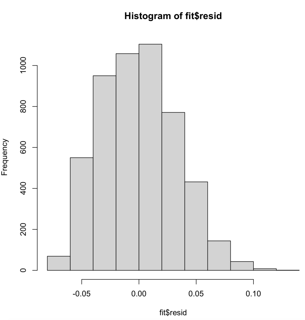
Next, we will look at the histogram of the residual errors within our linear regression model. As we can see here, it is normally distributed, which is a good thing.
Next to last, we will run the Q-Q plot. This runs the percentiles of the response against the percentiles of a normal distribution. In this plot, we want to see a linear pattern to show that we have a normal distribution. When we run the Q-Q plot for our data, we can see that our data deviates from the line near zero, probably due to the left skewness of our data, but other than that it looks fine.
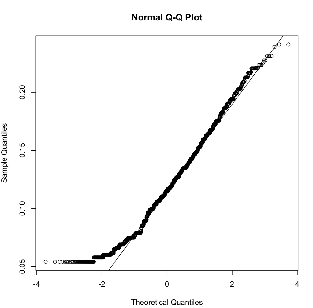
Finally, we look at the Q-Q plot for our residual errors. This, again, runs the percentiles against a normally distribution for residual errors. As we can see, the trend is fairly linear with deviations in either direction slightly, but to my knowledge this will still pass.
When looking at all my assumptions for my linear regression model, I believe that my model passes every assumption except assumption 3. When we look back at assumption 3, it barely fails the assumption, but it passes every other assumption with only minor hiccups. For this reason, I believe my linear regression model should pass all 5 assumptions due to my explanation of why some of these abnormalities may exist when running these tests of the assumptions.
Below are the R codes I ran to get all of these plots: